I started to look at existing Japanese restaurant brands to see what is already out there and to get a better idea of the range of printed material I can produce.

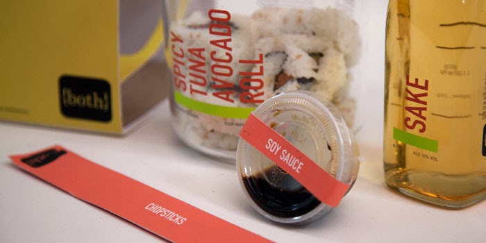
Menu and chopstick packaging are something I could design.


I like the use of the bamboo table mat, this could double up as a sushi rolling mat.


This example has a good range such as plates, uniforms and logo.


I the binding of this menu, it has traditional character balanced with a contemporary design.


I think the use of wood communicates quality and a touch of class.

This could be adapted into take away packing to add to the print range.


I like the illustrative feel to this menu. I think it would help to visualise the food to people who may not be familiar to the cuisine.


These logos use negative space which is something Im interested in using if its appropriate.


This design has been applied to a pop up van which could be something to think about.


I like the foiling finish in these designs. Also, beer mats are another option for the printed material.


I like the reference in this logo to the fish and the technical side of the preparation of the food associated with Japanese food.


This design incorporates manga style illustrations which could be a fun way to brand the restaurant. However Im not sure I have the ability to create such high quality illustrations as drawing isn't my strong point.

This design using a variety of vibrant exciting colours that draw attention. Colour is something I will need to experiment with depending on the style of restaurant I decide to design.


Loyalty card are a another option for the print materials but this also depends on the style of restaurant as I associate them with less up market establishments, more of a food chain.

Doggy bag/leftover bag is another print material I could apply the branding to.


Interior/Exterior
I started to have a look at how a design can be applied to the interior and exterior to get some ideas to propose.


I can mock up the exterior sign with the logo/name.


Designs could be applied to light fittings.


I like the idea of the dinners being in the center to create a gathering and a real sociable atmosphere.


These colours are contemporary and fun, this would suit the target audience.


I like the clean minimal look however I don't think it should be to clean cut incase it looses personality.


I like the minimal style illustration in this design, this could add some character to a simple design.

This is a good idea to propose, it creates an identity for the restaurant using a range a different media.


The colour scheme in these designs consists of two contrasting colours, I will need to choose a simple scheme for my design for maximum impact.


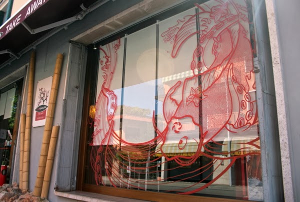
A window display is something I could propose with my design.

I would like my restaurant to have a section where people can go up and choose their food that would be cooked in front of them and also have a sit down area if people want table table service.


Something similar to this could be nice for the table setting or table mat.


This is a traditional Japanese type of binding that could be a possibility for the menu.


I like the square business card, I might use this format for my design.


A minimal illustration using block colours like this design is similar to what I have in mind.


This comment has been removed by the author.
ReplyDeleteIt is very informative article.
ReplyDeleterestaurant branding